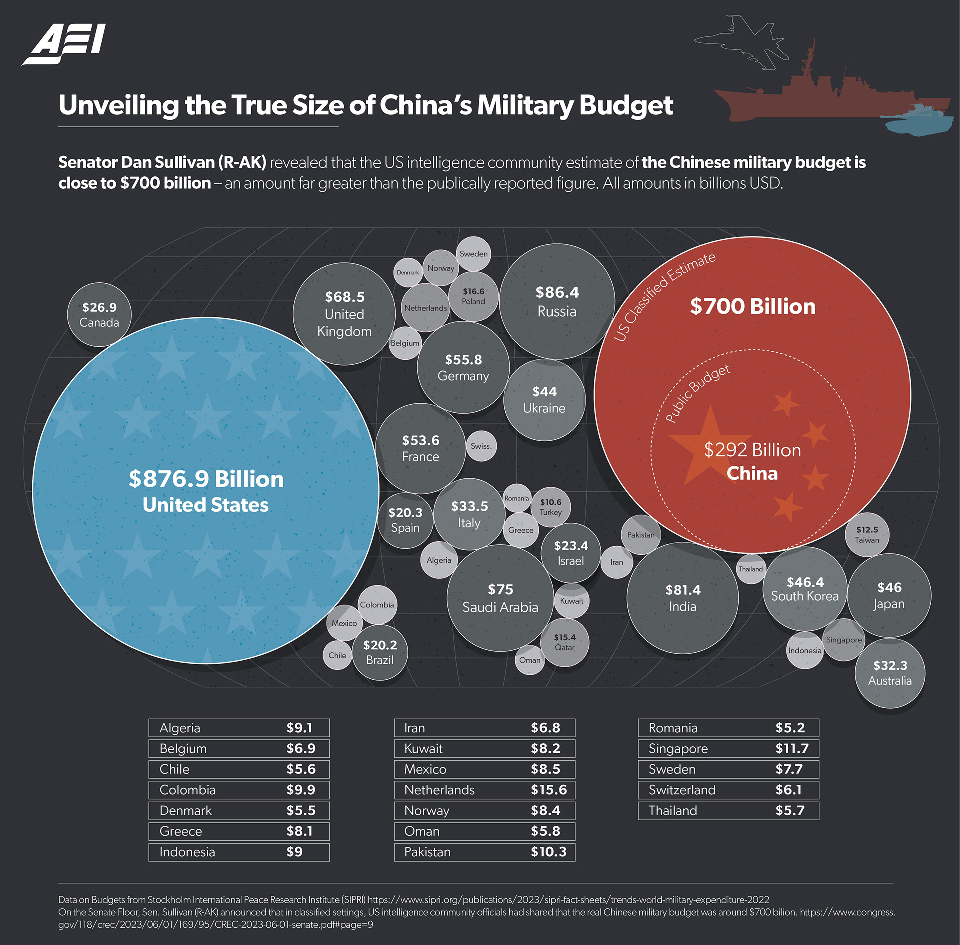
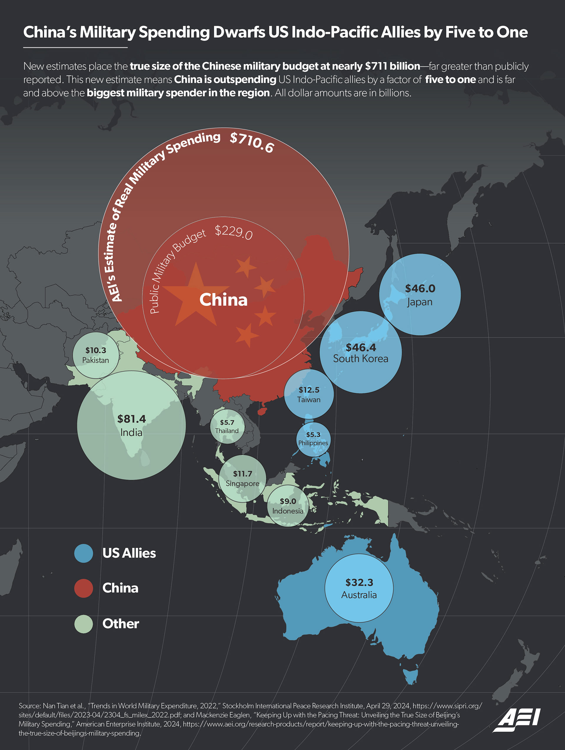
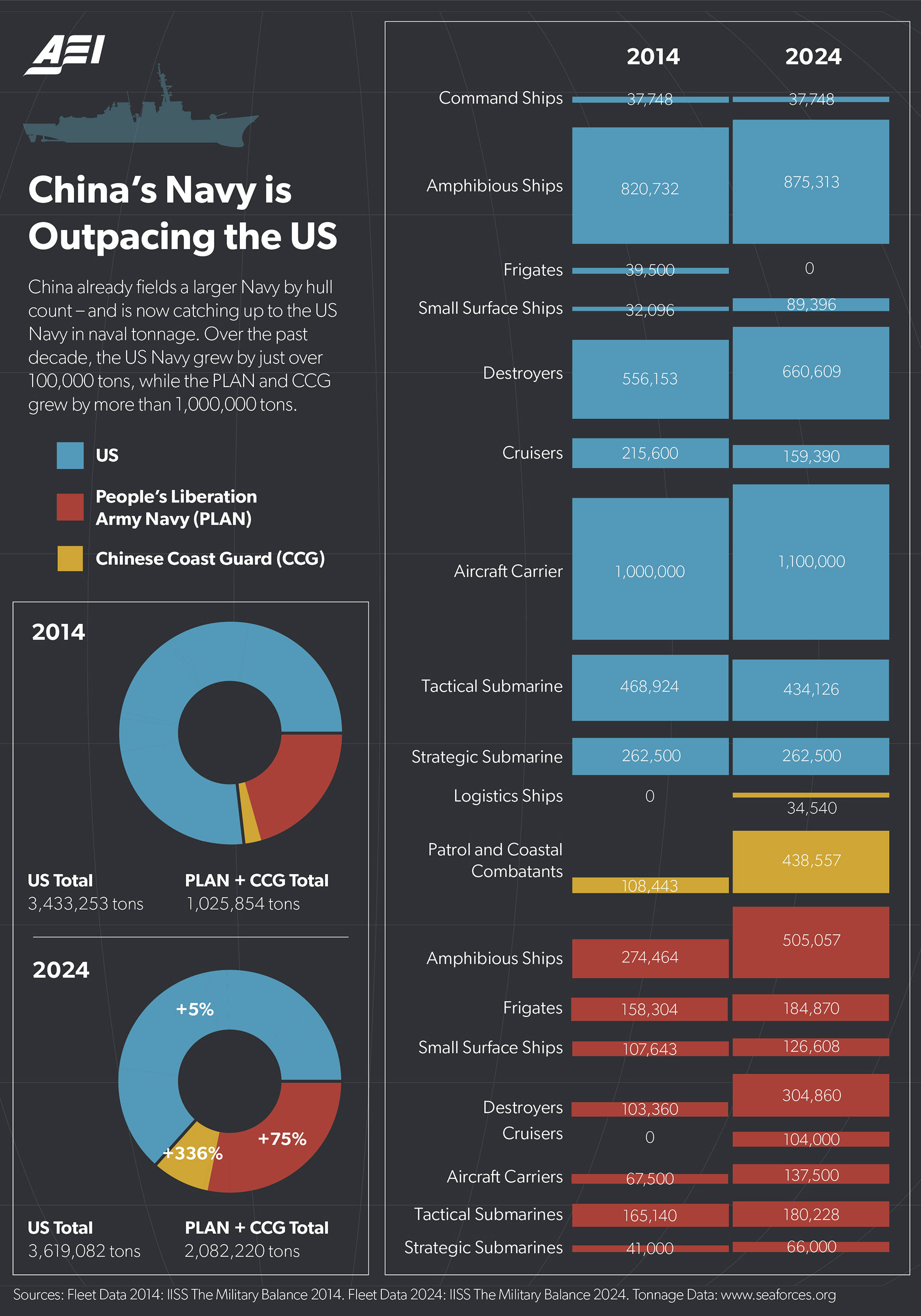
Military Budget Maps
This series of three maps was used in articles written by AEI scholar Mackenzie Eaglen on the size and trajectory of China’s military. The main challenge when designing these infographics was condensing the sheer amount of information into a compact and legible format.
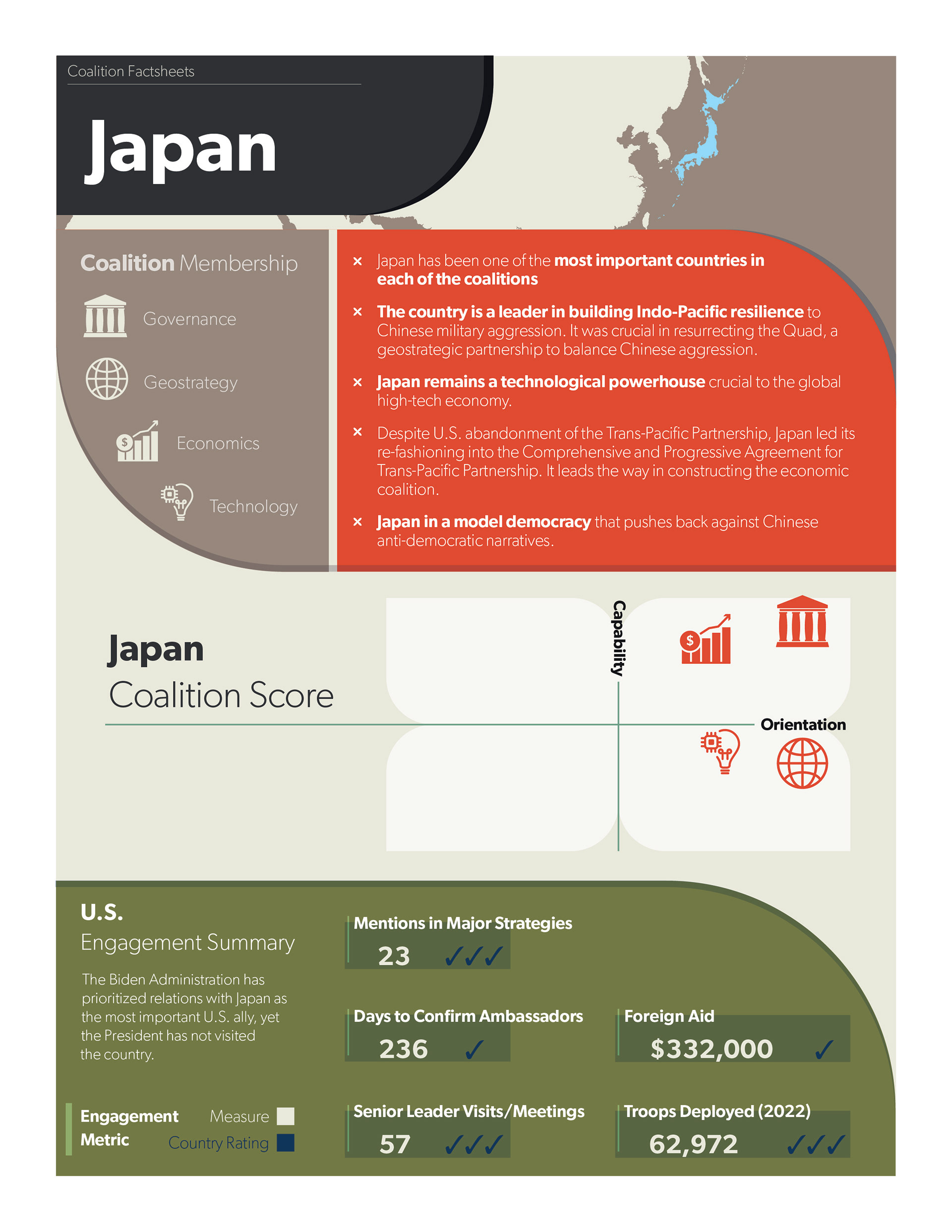
Coalition Factsheet Template
This template was designed for a report that assessed US allies' capabilities to form a coalition to limit China's influence in the Pacific. About 20 countries were assessed and compiled into a single report. The main challenge was creating a template that was eye-catching, but also could print in black and white.
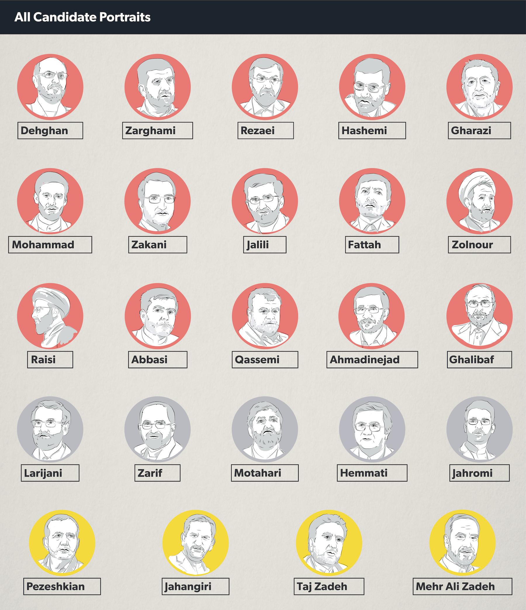
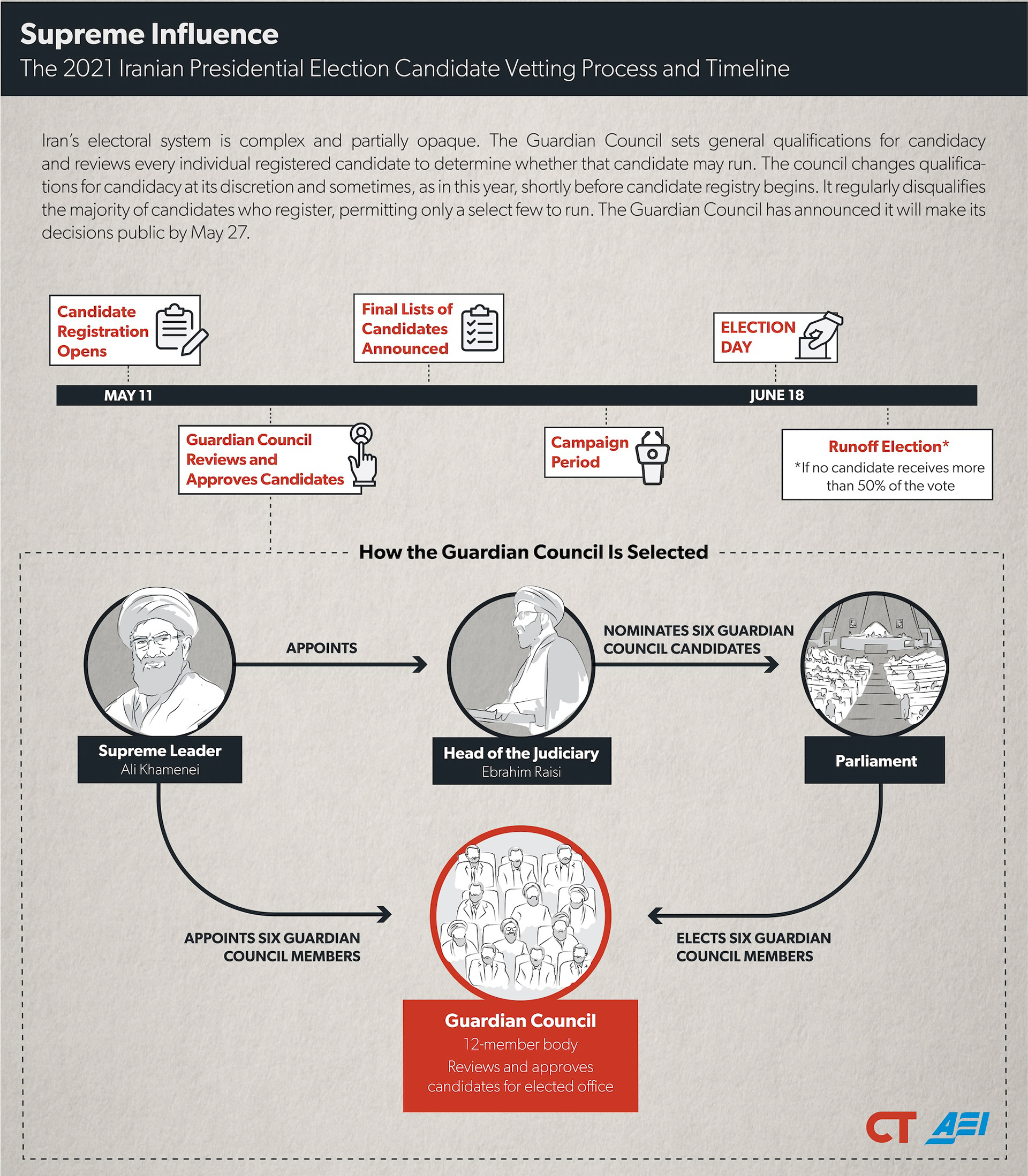
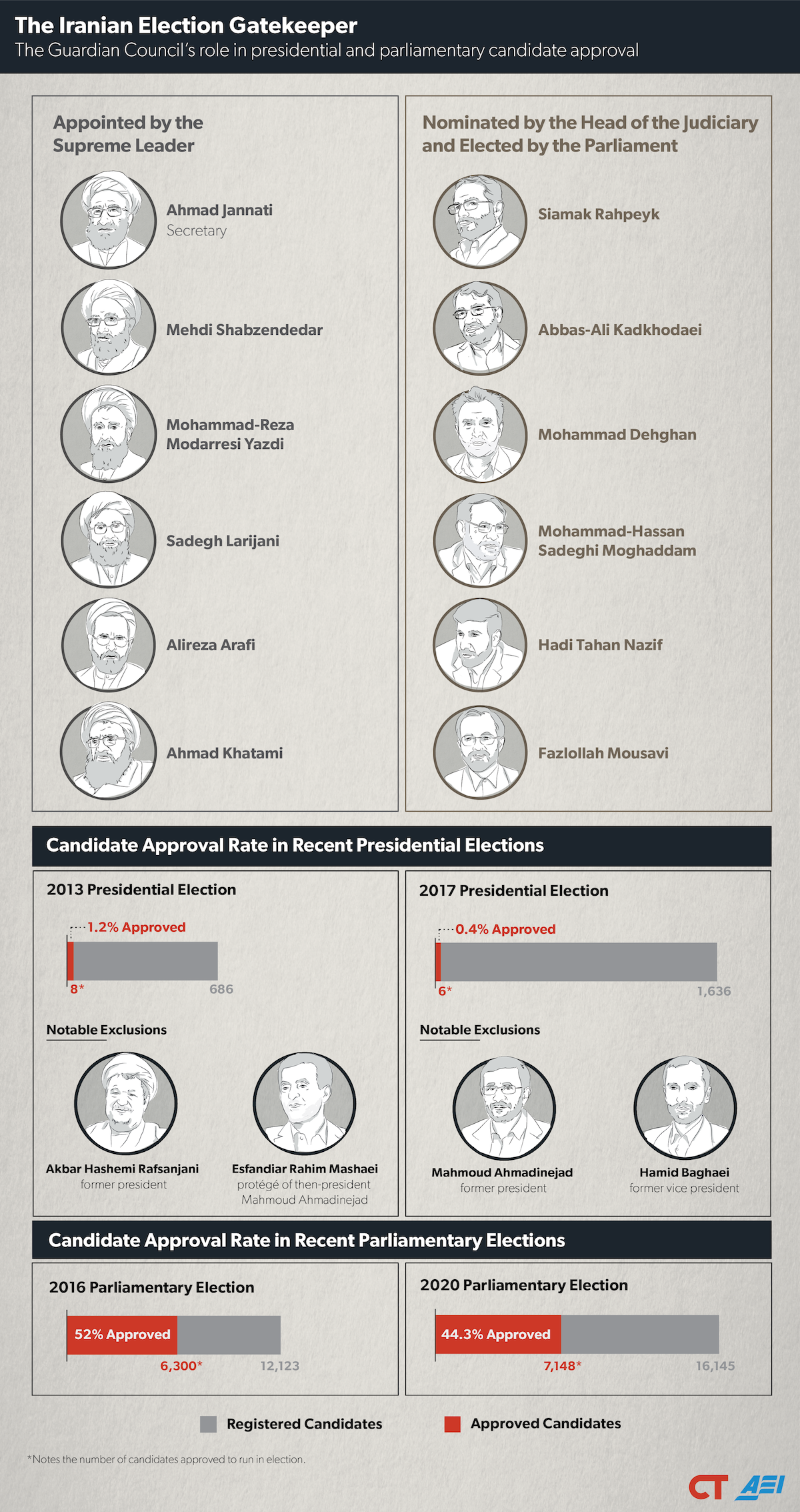
Iranian Election Watch 2021
This purpose of this visualization was to illustrate the changing candidate pool of the 2021 Iranian elections. Since it was difficult to find suitable photos of each candidate, I suggested we use illustrations, which would also make the project look more cohesive. The end product consisted of two static infographics and one Tableau dashboard that was updated when changes came in.
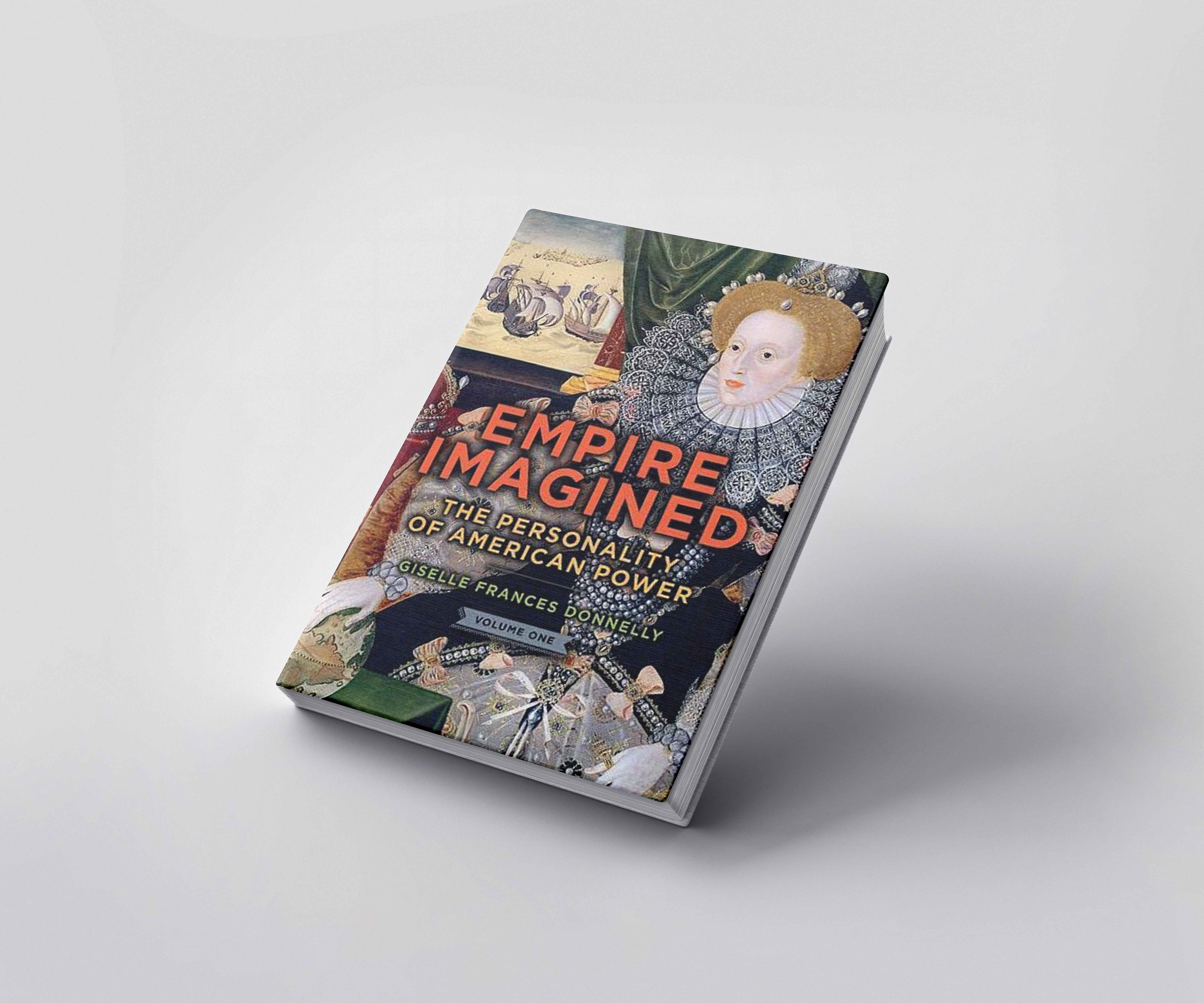
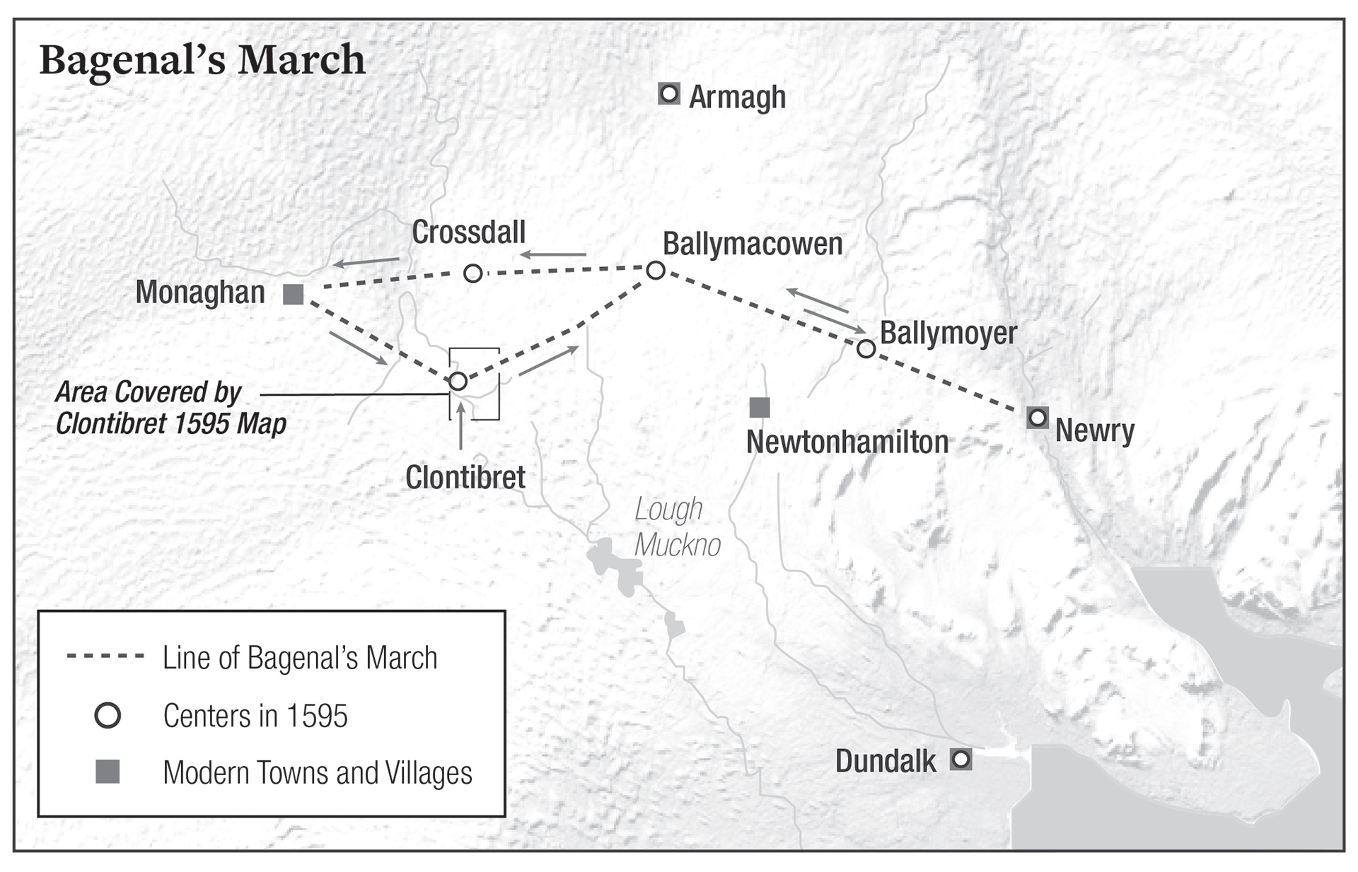
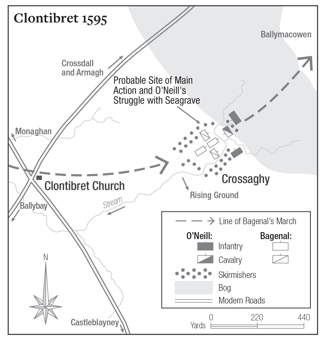
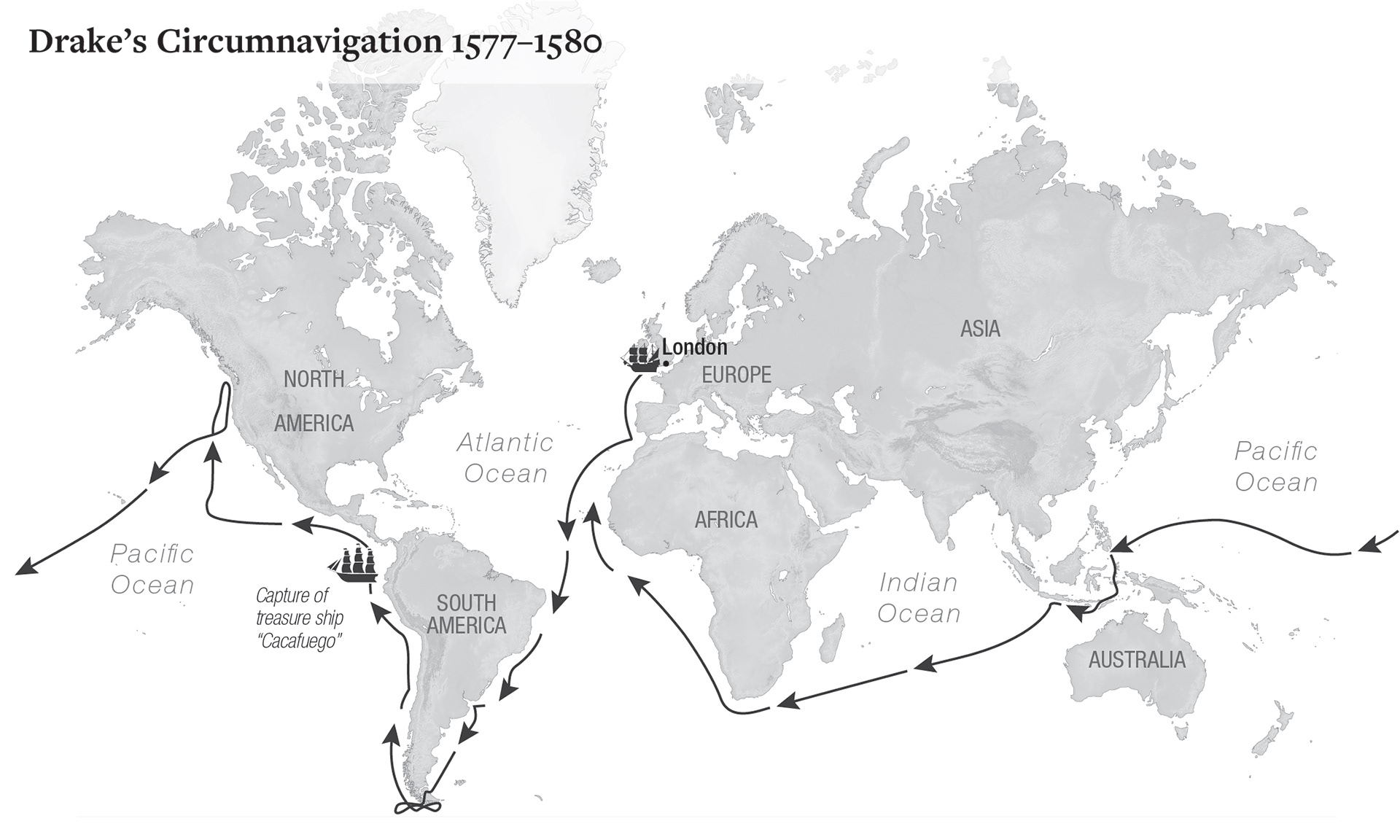
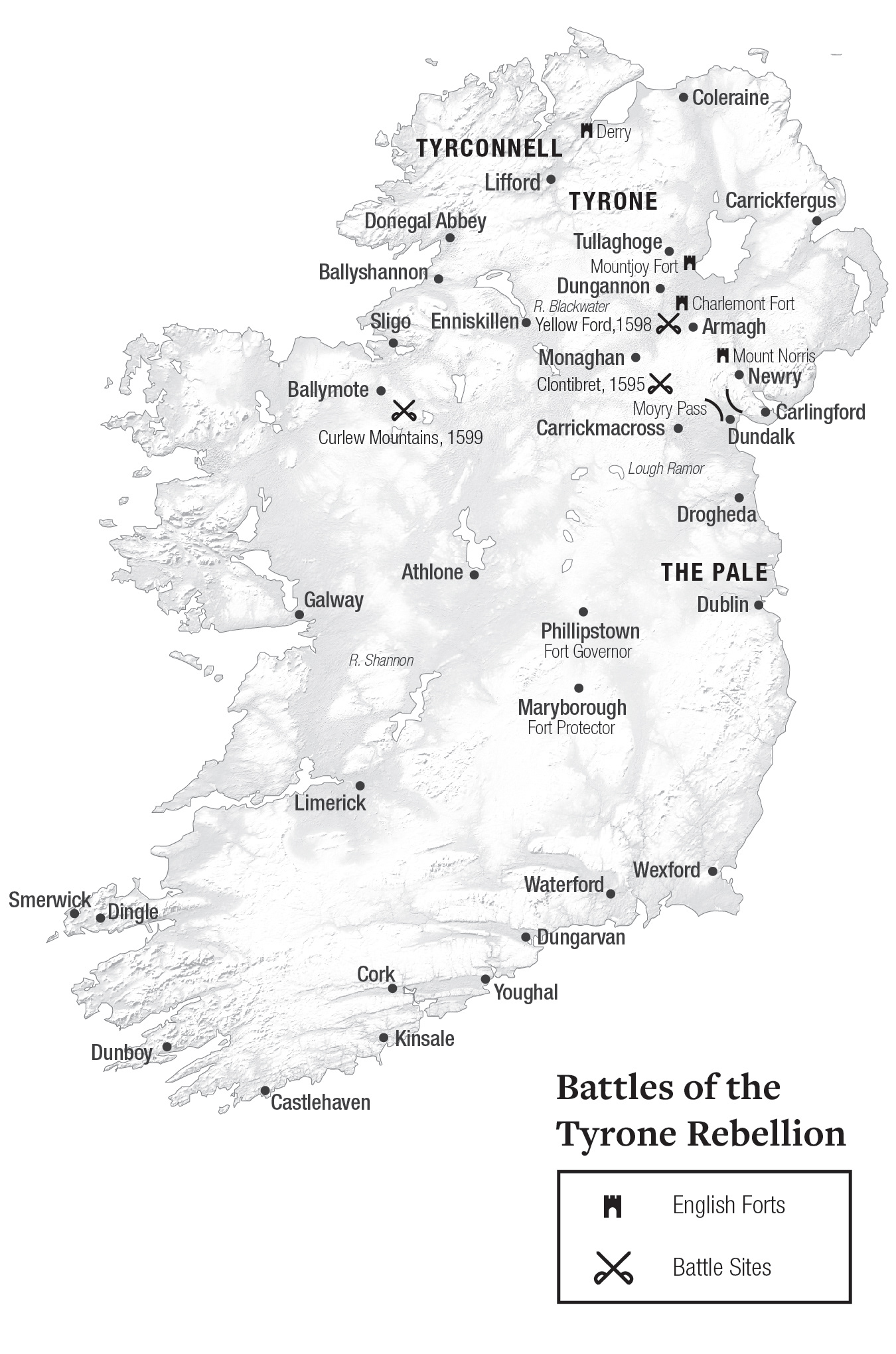
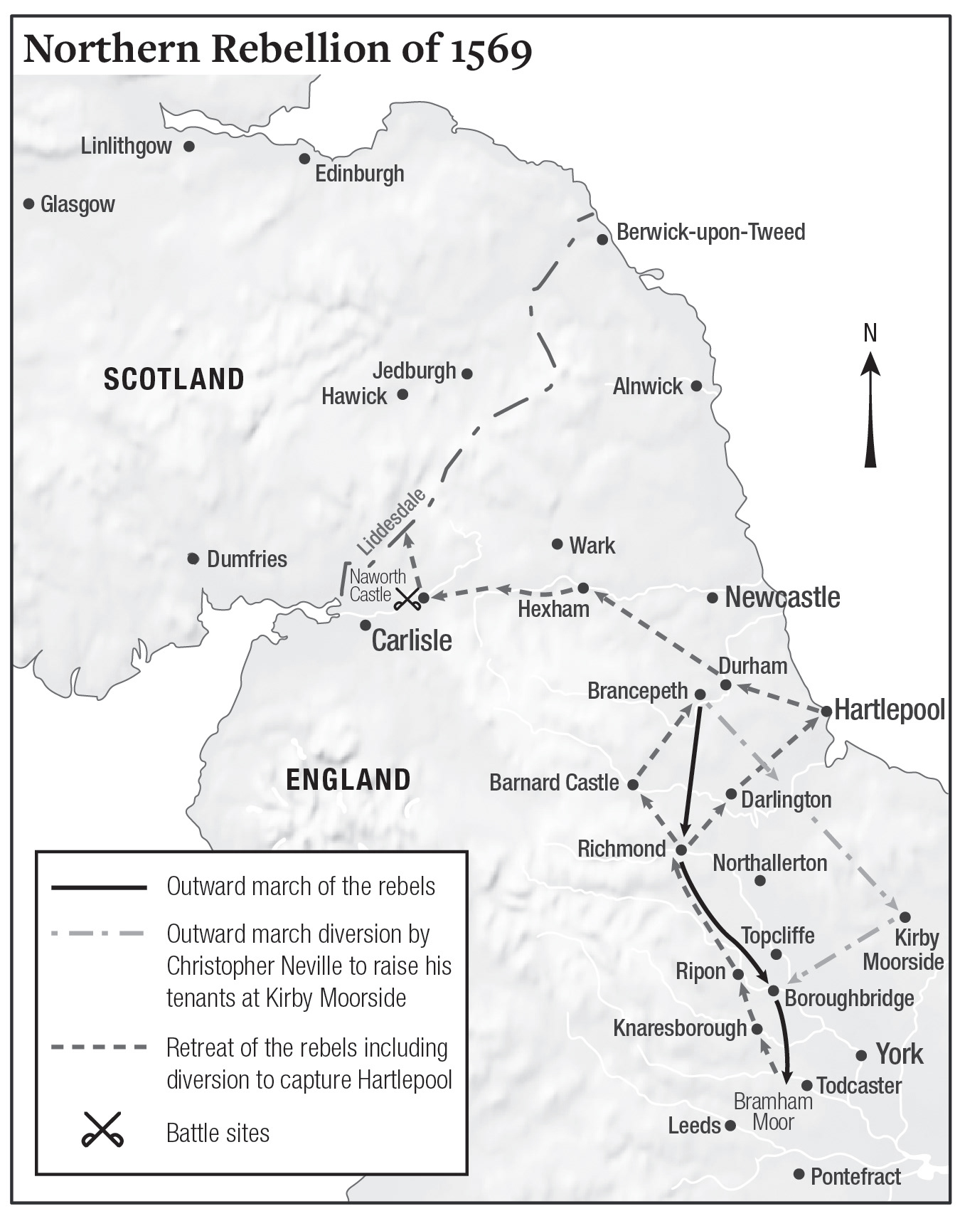
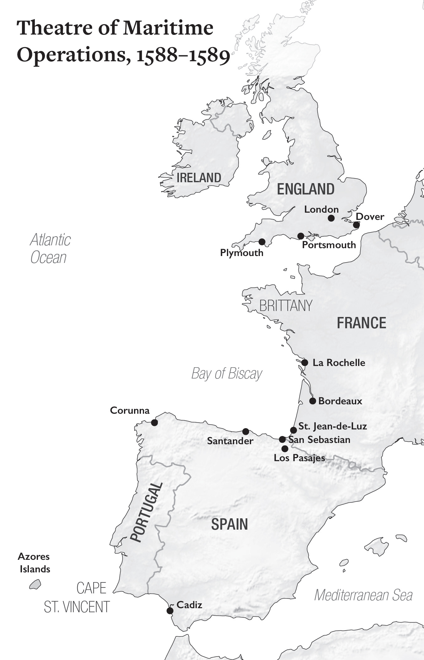
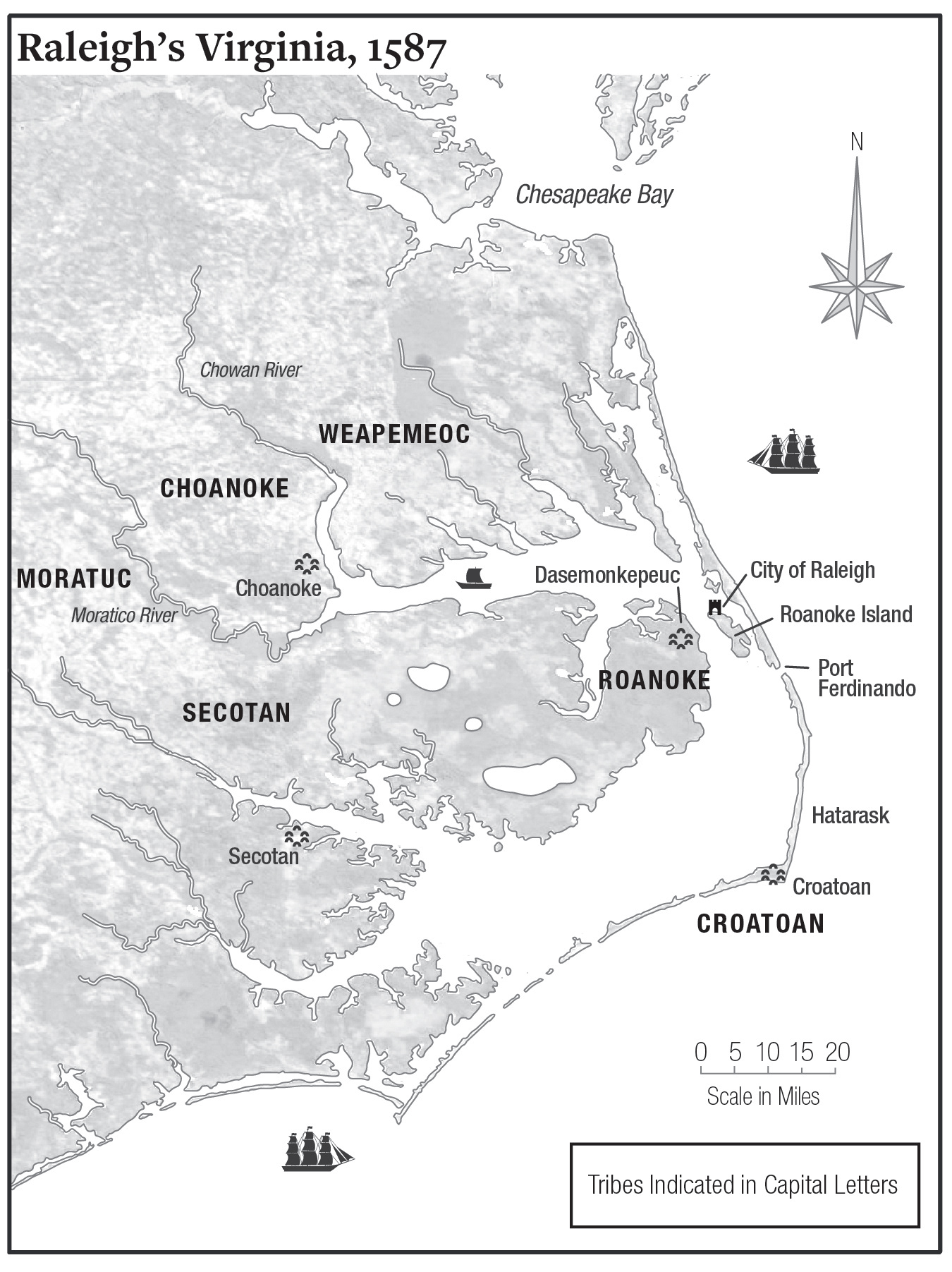
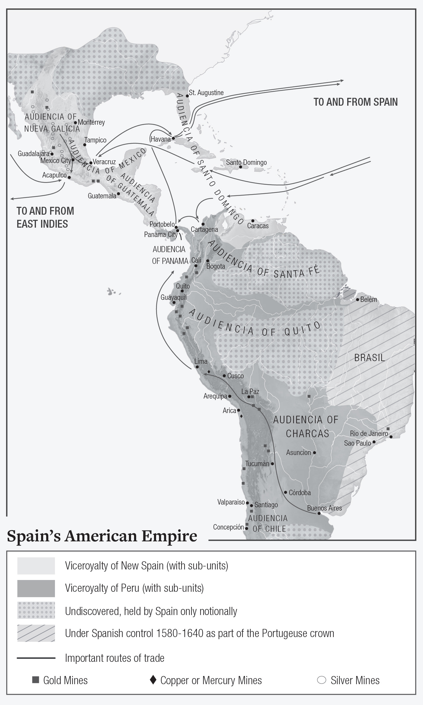
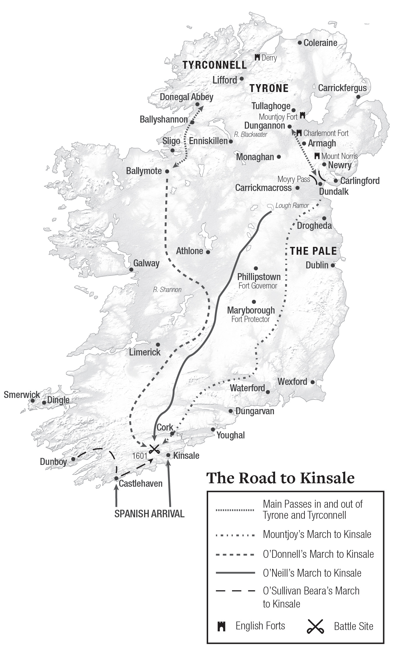
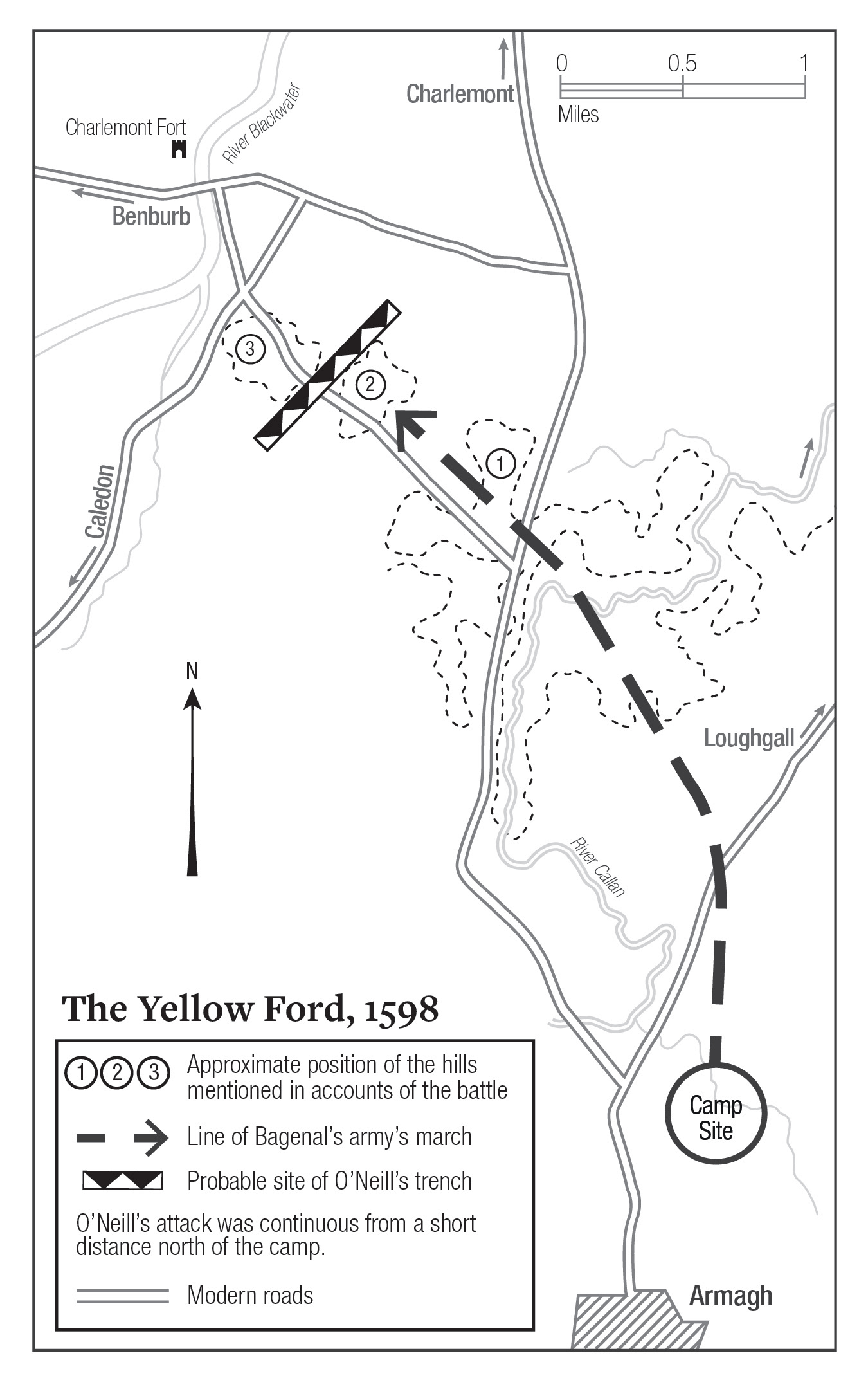
Maps for "Empire Imagined"
For her book Empire Imagined, Giselle Donnelly commissioned a series of maps of Ireland and the East coast of the United States. The main challenge of this project was making sure all the details of the map were legible while still being in grayscale.